5. Intensity Profiles / Image Formation#
This section describes how to display intensity profiles or, in the multidimensional case, intensity distributions from spectroscopic mapping data.
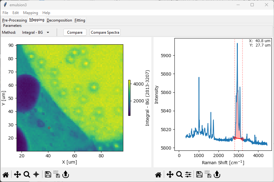
Fig. 5.1 The Mapping Window#
The Mapping window is split into two panes. The pane on the right displays a spectrum as well as one or more set of Controls to select a spectral parameter. The pane on the left displays the resulting intensity distribution.
Hint
The Controls (vertical lines) in the right pane of the Mapping window can be adjusted by dragging or by pressing the cursor keys. For more fine-grained control, double-clicking a control allows entering the position directly.
Tip
The range of the color scale can be adjusted by zooming (dragging while holding down the z key), panning (dragging while holding down the Alt key), or by double-clicking and entering the limits directly. Please see the section Graphing on how to navigate and manipulate graphs in SMDExplorer.
For two- or three-dimensional data, right-clicking in a graph gives access to additional display options:
Color Scale - selects the color scheme of the color scale.
Scaling - switches between logarithmic and linear scaling.
Fix Aspect Ratio - changes the aspect ratio of a graph, toggling between auto-fill (off) and square pixels (on).
Note
Auto-fill will scale the axes to occupy most of the window while square pixels will scale the axes so that the area occupied by each data pixel is square, i.e. an increment of 1 on the vertical axis has the same length as an increment of 1 on the horizontal axis. While the square pixels mode, which is the default, is scientifically correct, it can, depending on the dimensions of your dataset, result in graphs that are very narrow and hard to read.
Scale Bar - switches between axis display (default) and a scale bar.
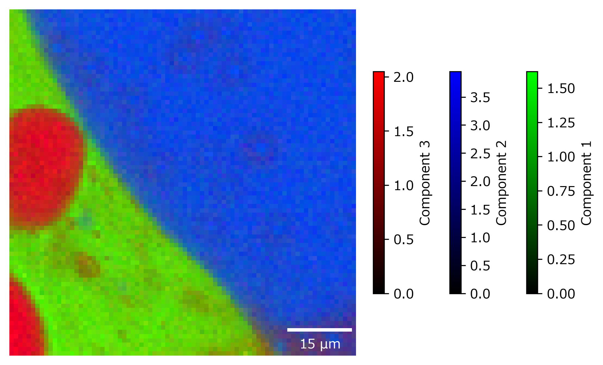
Fig. 5.2 A 2D-mapping with a scale bar.#
Important
Scale bar display will automatically switch the aspect ratio to square pixels mode.
Background Color - selects the graph background color. The background is typically only visible if data has been masked. Please not that this setting only applies to the current graph - changing the backgroun color for all graphs can be performed in Preferences.
Save Slice (3D data only) - saves the currently displayed slice of the 3D volume as a
.smdor.hdf5data file.
The spectrum displayed in the right pane can be selected by clicking in the mapping. The selected spectrum is indicated by a red circle (2D and 3D mappings) or a red vertical line (1D mappings). For 1D, 2D, or 3D data, you can also select to display an average spectrum rather than a single spectrum. To switch between single-spectrum and average spectrum modes, use the cross-hair toggle in the mapping toolbar and drag in the mapping / intensity profile to select a range (see The Mapping Window - Ratio for an example).
Hint
The coordinates / time stamp of the currently selected spectrum / spectral range will be displayed in the spectrum pane on the right.
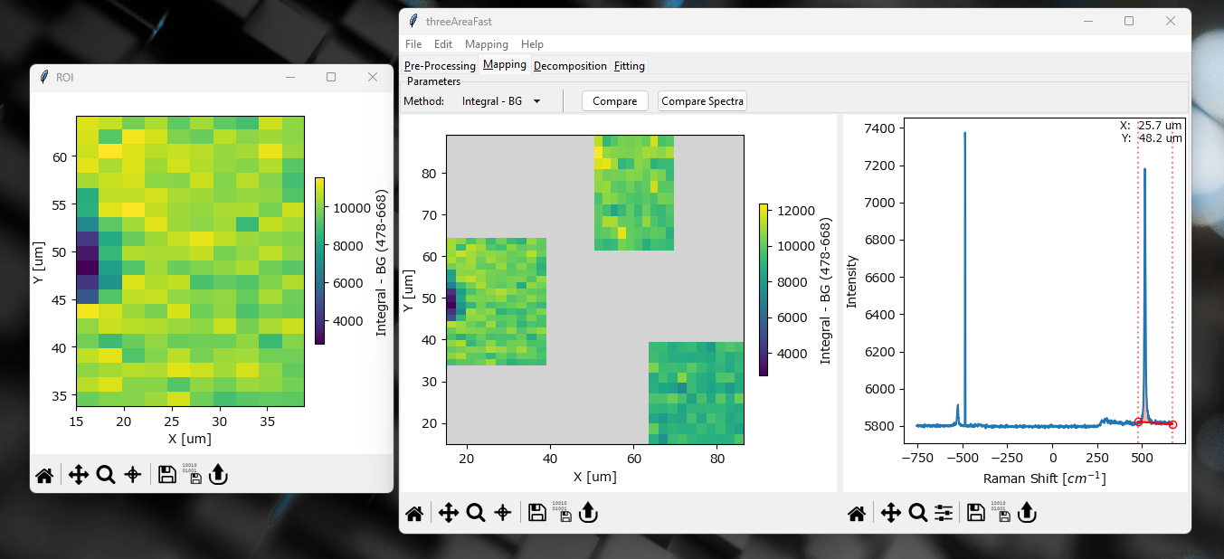
Fig. 5.3 The Mapping Window - Multi-area Scans#
For datasets involving multiple two-dimensional scan areas, additional options display options are available.
right-clickingon a scan area and selecting Display in new window will display the selected area in a new window.Note
Displaying in a new window can be advantageous as it gives more freedom for adjusting the color scale. When displayed in the multi-area view, default color scaling is from the minimum to the maximum of the entire dataset, i.e. all scan areas. When displayed in a single window, color scaling is performed only for the selected area.
scan areas can be saved as individual files using . This allows independent analysis / preprocessing of each scan area.
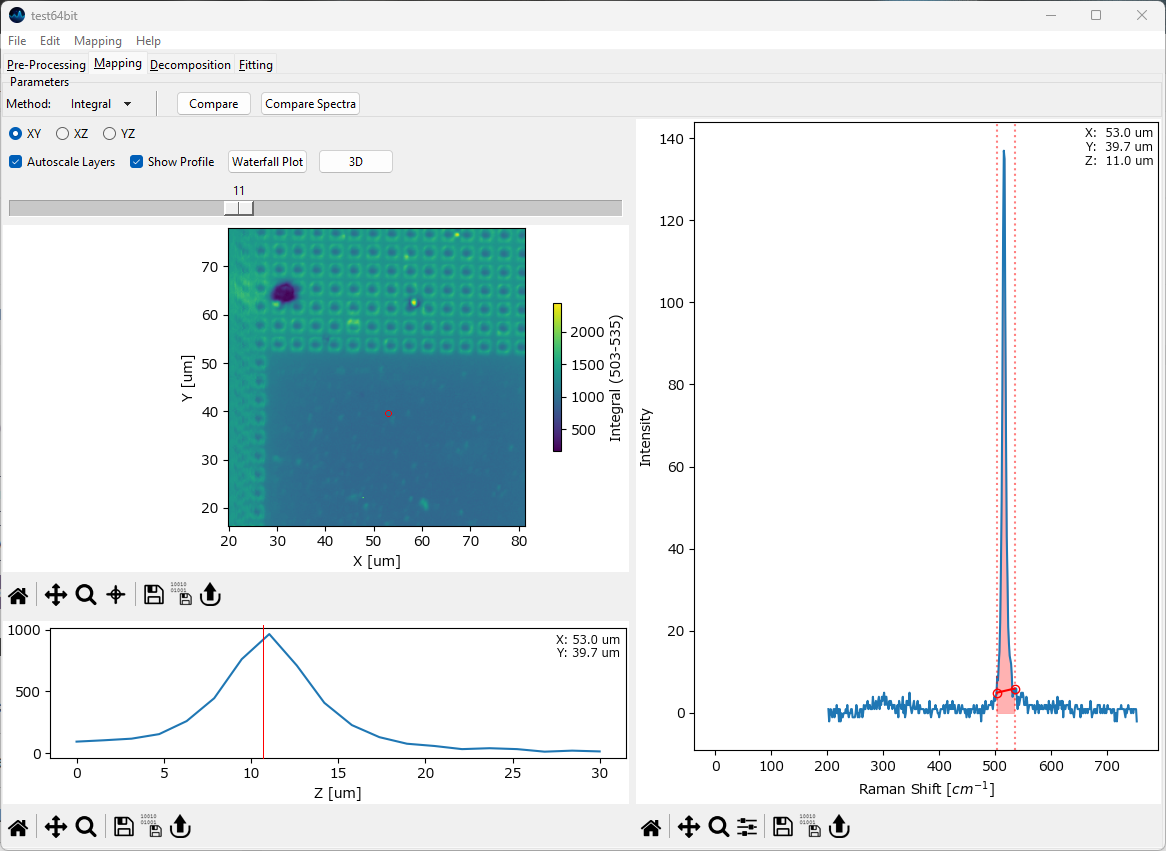
Fig. 5.4 The Mapping Window - 3D data#
For three-dimensional data, the currently selected layer as well as the projection (XY, XZ, YZ) can be selected.
- Autoscale Layers
This checkbox selects whether the color scale should be adjusted for each layer individually or whether the upper and lower limits of the color scale should reflect the minimum and maximum of the entire dataset.
- Show Profile
When checked, a line profile perpendicular to the selected projection is displayed below the mapping. For example, for an XY slice of the data the profile contains the intensity along the Z direction at the selected data coordinate. The selected data coordinate can be changed by clicking on the mapping; it will be displayed in the profile. If a region rather than a single coordinate is selected, the profile will contain the average signal along in the selected region.
Tip
Selecting a region allows computation of profiles / waterfall plots along a plane intersecting the 3D data.
- Waterfall Plot
Displays a waterfall plot of the spectra that correspond to the locations displayed in the profile. The spectral data displayed in the waterfall plot can be exported allowing flexible extraction of data from 3D or 2D-temporal scans.
- 3D
Displays a three-dimensional rendering of the data.
Hint
Three-dimensional data offers a number of additional export options, which are available through the menu:
TIFF Stack: Exports the mapping data as a TIFF stack for analysis in third-part software. While the scale information is, in principle, preserved in the TIFF file, third-part support can vary. Two export options are available:
TIFF file: Export at the original sample intervals (with embedded scale information)
TIFF file (Equal spacing): Saves an interpolated version of the data with cubic voxels, which ensures that the data will be correctly displayed in third-party software that does not account for unevenly scaled axes
Note that the original axis ranges and scaling are available in the acquisition parameters window or, if denoising by binning has been performed, in the denoising screen of the preprocessing tab.
Sequence: Saves the mapping data as a sequence of consecutively named TIFF files.
Montage: Saves each slice of the 3D-mapping (along the selected axis) as a montage.
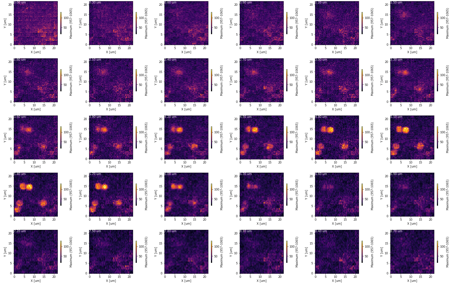
Fig. 5.5 A Mapping Montage#
Animation: Saves an animation that moves through the selected projection using the currently selected display parameters.
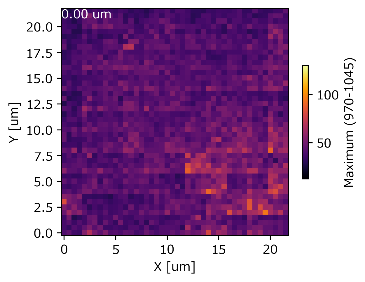
Fig. 5.6 A Mapping Animation#
5.1. Intensity Profile Options#
The Method drop-down menu allows selecting various spectral parameters to compute. The selected image formation method as well as the selected spectral range is also displayed in the resulting mapping.
- Integral
computes a running sum between the start and end of the selected spectral range (red vertical lines in the right pane in The Mapping Window).
- Integral - BG
computes a running sum between the start and end of the selected spectral range and subtract the line connecting the start and end points as the baseline. The red shaded region in The Mapping Window illustrates this computation.
- Ratio
computes the intensity ratio between two separate spectral regions, i.e. the ratio between running sum of the red spectral region and the green spectral region in The Mapping Window - Ratio.
- Ratio - BG
computes the intensity ratio of two separate spectral regions by first calculating a running sum between the endpoints of each region, subtracting the line connecting the endpoints as the baseline, and then calculating the ratio of the two baseline-corrected intensity sums (see Integral - BG for calculating the baseline-corrected intensity integral for a single spectral region).
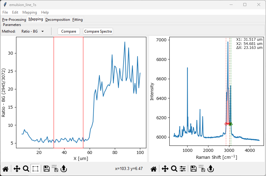
Fig. 5.7 The Mapping Window - Ratio#
- Maximum
computes the maximum intensity in between the start and end points of the selected spectral region.
- Max. Location
computes the location (on the spectral axis, e.g. in wavenumbers) of the maximum intensity value between the start and end points of the selected spectral region.
- FWHM
computes the full-width at half maximum of the peak in the selected spectral region.
- Centroid
computes the centroid (center of mass) of the peak in the selected spectral region. For symmetric peaks, this is equal to the peak’s location, i.e. its highest value. Unlike Max. Location, Centroid can interpolate the location and thus compute peak positions at a resolution higher than the spectral resolution of the data. The center of mass is defined as:
(5.1)#\[ x_{\text{COM}} = \frac{\sum{x_i I_i}}{\sum{I_i}} \]Here (5.1), \(x_i\) is a spectral location and \(I_i\) is the intensity at this location. For not perfectly symmetric peaks or data affected by noise, computation of the Centroid can be affected by the selected spectral range.
See also
Peak Deconvolution can provide high-resolution peak positions and peak widths, especially for overlapping peaks where the naive computation of the Centroid and Full-Width at Half-Maximum fail.
- Centroid in FWHM
computes the Centroid in between the borders of the full-width at half maximum within the selected spectral region.
5.2. Comparing Spectra#
Different spectra obtained during a mapping / time scan can be compared by clicking the Compare Spectra button in the Mapping window toolbar or by selecting the menu item. This opens a new window and appends the currently displayed spectrum. Multiple spectra can be added as desired.
Hint
The drawing order can be changed by
right-clickingon a legend entry and selecting Bring to front or Send to back.spectra can be renamed by right-clicking a soectrum legend entry and selecting Rename. The default name is the coordinates of the spectrum.
spectra can be scaled / offset by right-clicking on a legend entry and selecting Modify Trace
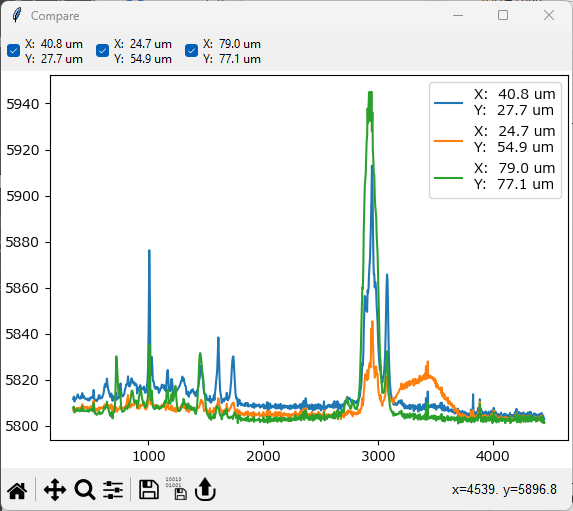
Fig. 5.8 Spectra Comparison#
- Export
Export the currently displayed spectra as a
.hdf5or.mdtspectral database. This file can be reimported into SMDExplorer to analyze individual spectra.See also
.csvexport is available through the standard graphing controls.
5.3. Comparing Intensity Profiles / Images#
During analysis, it is often instructive to compare the intensity of different spectral regions. SMDExplorer offers several ways to achieve this:
for one-dimensional or two-dimensional data, simply click on the Compare button or select . This will open a new window that contains the currently displayed mapping or intensity profile. Next, adjust the spectral range in the right pane of the Mapping window and click Compare again. This will add the newly computed mapping / intensity profile to the comparison window. This procedure can be repeated as many times as needed.
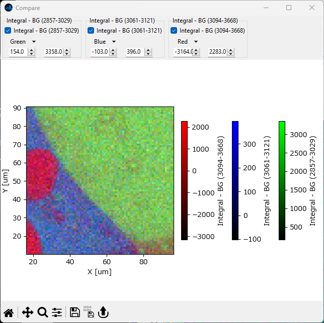
Fig. 5.9 Mapping Comparison#
Hint
The top toolbar in the Comparison Window allows selecting which mappings to display in the comparison graph. The color scales and ranges of the displayed mappings can be individually adjusted for better contrast.
for one-dimensional data, intensity profiles can be exported as
.csvfiles or copied to the clipboard for quick display in third-party software. See Graphing for details.for two-dimensional or three-dimensional data, spectral mappings can be exported as floating point
.tiffiles containing the data displayed in the mapping window. This data can then be displayed and analyzed in third-party software. For three-dimensional data in particular, additional options are available using the menu.three-dimensional data will displayed in the 3D Window
Tip
ImageJ is a free, cross-platform image-analysis software that offers a wide range of image analysis and visualization methods beyond the scope of SMDExplorer.
5.4. Line Profiles#
The Line Profile (available via ) function allows plotting the intensity profile of a two-dimensional mapping along a straight line.
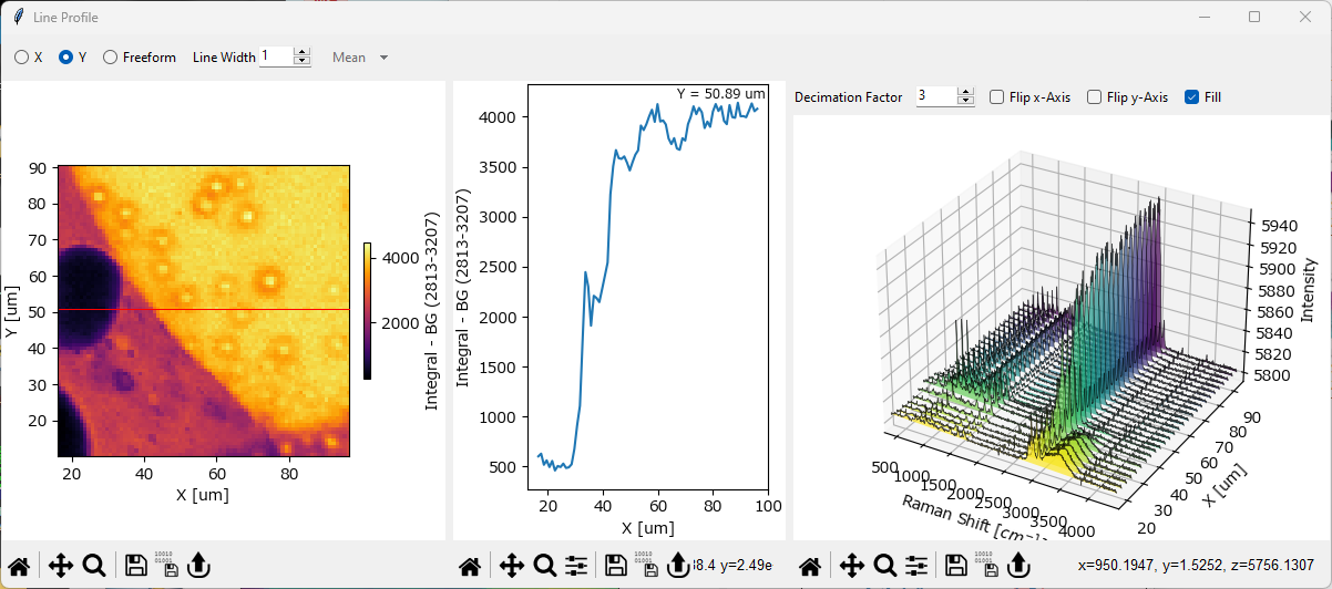
Fig. 5.10 The Line Profile Window#
The Line Profile Window contains three panes:
The Mapping pane (left). This contains a copy of the original mapping (the mapping that was displayed when selecting ).
The Line Profile pane (center). This contains the intensity profile, i.e. the values of the datapoints that fall on the user-selected line. The coordinate(s) of the plotted profile are displayed in this graph.
The Waterfall Plot pane (right). This pane contains the spectra at the coordinates of the user-selected line. For details, see the Waterfall Plots section.
Parameters
- Line Profile Type
The direction / type of the line profile:
X - displays a line profile at a constant value of the horizontal axis.
Y - displays a line profile at a constant value of the vertical axis (see red line in the left pane in The Line Profile Window for an example).
freeform - displays a line profile between two user selected points. To adjust the coordinates of the line profile, simply drag in the left mapping pane of The Line Profile Window - the center and right panes will update accordingly.
- Line Width
The number of points across which to calculate the line profile and spectra. For \(1\), the default, only points directly on the line are taken into account. For higher values, e.g. \(3\), additional points above / below (or left / right of) the line are taken into account as well and the line profile is computed according to the selected Function.
- Function
If Line Width is larger than 1, the function to apply to the selected coordinates. For example, a Line Width of 3 and the function Mean will calculate the arithmetic mean of the point directly above the selected line, the point on the line, and the point directly below the selected line, and do this for every point on the line to compute the line profile. The same computation is performed for the spectra displayed in the Waterfall Pane as well. Available functions are:
mean: Computes the arithmetic mean of the selected coordinates.
median: Computes the median of the selected coordinates.
maximum: Computes the maximum of the selected coordinates.
minimum: Computes the minimum of the selected coordinates.
sum: Computes the sum of the selected coordinates.
5.5. Waterfall Plots#
A Waterfall Plot is a three-dimensional graph that shows how spectra change along a spatial or temporal dimension. Waterfall Plots are available in SMDExplorer for one-dimensional data (e.g. time interval scans) and when plotting line profiles to analyze how intensities and spectra change along a selected straight line in a 2D-mapping.
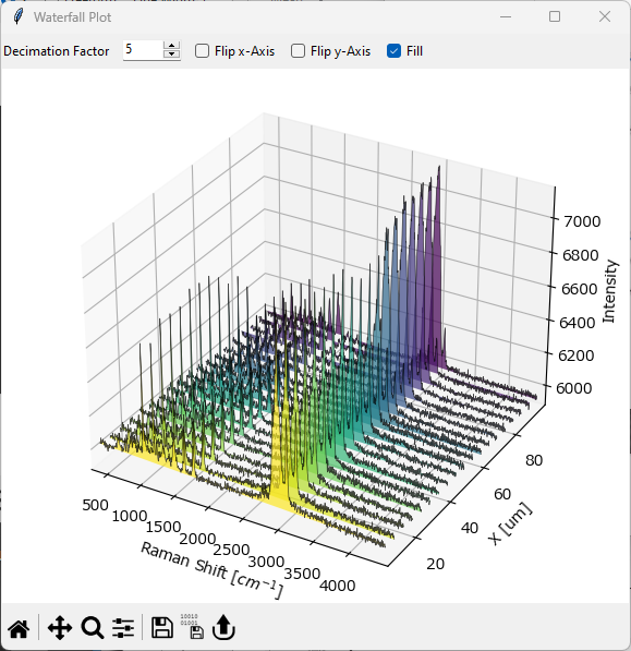
Fig. 5.11 The Waterfall Plot Window#
To display a Waterfall Plot of a one-dimensional dataset, select . This will open The Waterfall Plot Window.
Parameters
- Decimation Factor
This number determines what fraction of spectra to display. \(1\) displays every spectrum, \(2\) every second spectrum, \(3\) every third spectrum and so on.
Note
To avoid the 3D-plot from becoming too busy with data, the Decimation Factor is automatically adjusted to give visually pleasing Waterfall Plots.
- Flip x-Axis:
Inverts the direction of the spectral axis. Depending on the dataset, this can make spectral change easier to see.
- Flip y-axis
Inverts the direction of the spatial / temporal axis.
- Fill
Fills the area between the curves and the xy-plane with different colors to make the spectra obtained at different times / locations visually distinct. If turned off, no fill is applied (see Figure 5.12 for an example).
- Save Animation
Saves the Waterfall plot as an animation file (see Figure 5.12 for an example).
Hint
The easiest way to adjust the axes ranges in the Waterfall Plot is to use Cropping and Range Selection to trim the dataset to the desired region. In addtion, the displayed range can be selected by double-clicking the axes in the plot.
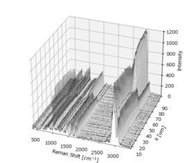
Fig. 5.12 A Waterfall Plot Animation#
5.6. Spectrograms (2D Spectral Stacks)#
Spectrograms are two-dimensional plots that show the evolution of spectra with respect to time, even though a spatial dimension can in principle be used as well. The horizontal axis displays the spectral dimension, for example the Raman shift in wavenumbers, while the vertical axis shows the dimension along which the spectra were recorded. The intensity of the spectra at each point is indicated by different colors. In a sense, spectrograms are equivalent to waterfall plots when viewed from the top (perpendicular to the xy-plane).
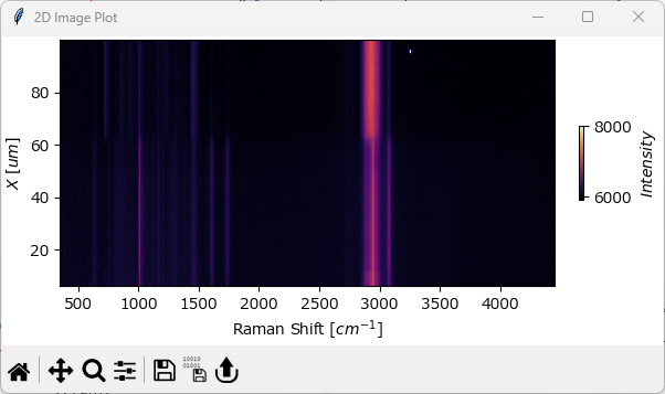
Fig. 5.13 The Spectrogram Window#
Note
Spectrograms are useful to visualize peak shifts or changes in peak width over time, especially if the data has been normalized.
To display a spectrogram, select . Please note that this option is only available for one-dimensional data.
5.7. Spectral Surface Plot#
Spectral surface plots are a pseudo three-dimensional representation of a 2D spectrogram with the one axis representing the spectral coordinate, for example wavenumber, another axis representing a spatial or temporal coordinate, and the third axis representing intensity. Spectral surfaces are similar to waterfall plots but display the dataset as a smooth surface rather than discrete spectra.
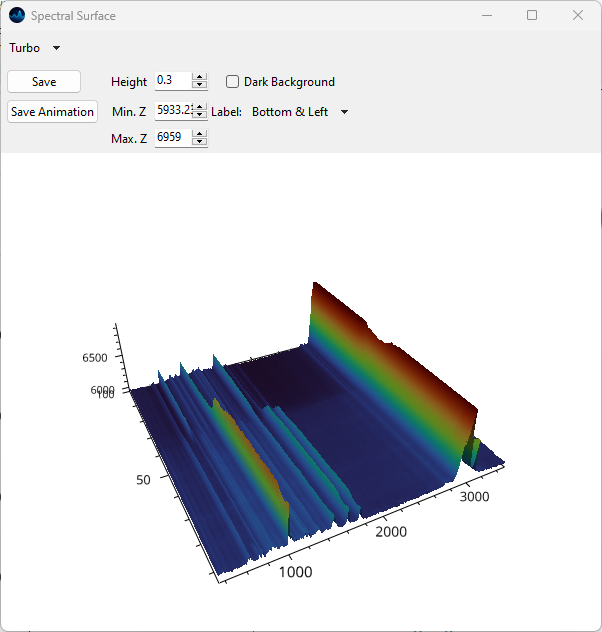
Fig. 5.14 The Spectral Surface Plot Window#
To display a Spectral Surface Plot of a one-dimensional dataset, select . This will open The Spectral Surface Plot Window.
Note
Spectral Surface Plots are only available on Windows and Linux.
For a description of display parameters, please see the section on the surface plots, which are closely related.
Just like surface plots, spectral surface plots support animation.
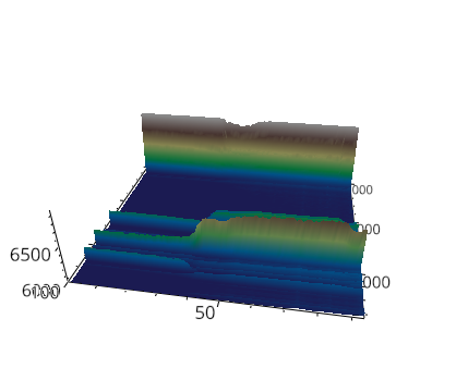
Fig. 5.15 A spectral surface animation.#
5.8. Surface Plots#
Surface plots visualize two-dimensional intensity distributions as a topographical image.
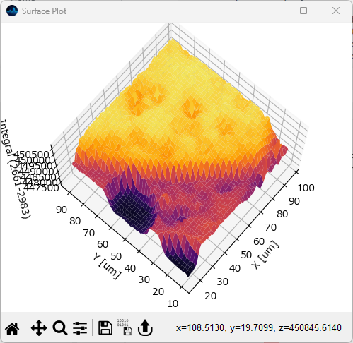
Fig. 5.16 The Surface Plot Window#
To display a surface plot, select . Please note that this option is only available for two-dimensional data.
Parameters
- Mode
The rendering mode to use. Available options are
OpenGL: Uses hardware-accelerated OpenGL rendering. This option is available on Windows and Linux.
MPL: Uses a software renderer, which has worse performance for large datasets.
- Color Scale
The color scale to use for plotting the surface
For the OpenGL renderer, the following additional options are available:
- Height
The fraction of the longest axis to use for plotting the elevation of the surface. Lower values result in flatter surface mappings, higher values lead to more pronounced peaks and valleys. The default is 0.5.
- Min. Z
The minimum z-value to use for plotting. The default is the minimum value in the mapping.
- Max. Z
The maximum z-value to use for plotting. The default is the maximum value in the mapping.
- Dark Background
Allows toggling between a white or black background. The color of the axes will be adjusted as required.
- Flip Z
Inverts the vertical (z)-axis
- Label
Allows selecting which axes to label.
- Save
Saves the image to disk as
.pngor.jpeg.- Save Animation
Save a rotation animation of the surface plot. For details on rotation parameters, please see the section on exporting animations for details.
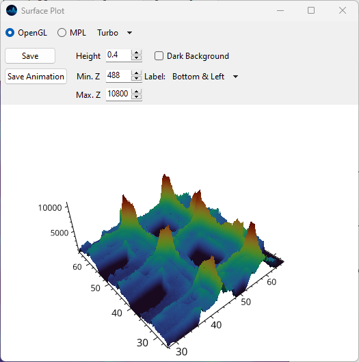
Fig. 5.17 The Surface Plot Window in OpenGL mode.#
5.9. 3D Plots#
Three-dimensional data from hyperspectral cubes can be displayed as an interactive three-dimensional plot. This functionality allows the visualization of structures and the comparison of the location of different chemical components in space. 3D visualization is designed for spatial three-dimensional data. The 3D window can be accessed from the following places:
the 3D button in the 3D pane.
the Compare button when analyzing 3D data in the Mapping tab.
the Compare button in the Explore Fits window.
the Show Overlay menu item in the Decomposition tab. This will also display the characteristic spectra of the extracted components.
- Display Mode
Allows the selection of:
isosurface rendering
overlay of slices (XY, XZ or XZ).
Note
Volumetric rendering is only available on Windows and Linux.
5.9.1. Isosurfaces#
Isosurfaces are the three-dimensional analog of isolines. They represent a surface of constant value in an intensity voxel.
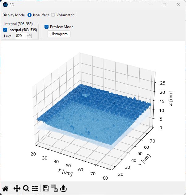
Fig. 5.18 The 3D isosurface rendering view.#
- Level
The intensity level at which to draw the isosurface.
- Preview Mode
When checked, the number of polygons is reduced to speed up rendering. Uncheck before exporting the final plot.
- Histogram
Displays an intensity distribution of the intensity values in the 3D voxel. This can help selecting an appropriate intensity value for the isosurface.
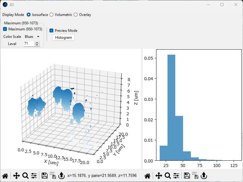
Fig. 5.19 The 3D isosurface rendering view with histogram display.#
5.9.2. Volumetric Rendering#
Volumetric rendering is performed using the Maximum Intensity Projection algorithm.
Hint
The viewport can be changed by dragging in the figure while holding down the left mouse button.
Scolling or dragging while holding down the right mouse button will zoom into our out of the rendering.
Dragging while holding down the Shift key and the left mouse button will pan in the view.
Dragging while holding down the Shift key and the right mouse button will change the perspective of the projection.
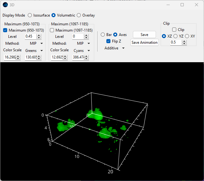
Fig. 5.20 The 3D volumetric rendering window.#
A number of parameters can be set individually for each plot object:
- On-Off
Allows deactivation of the object, deactivated objects will not be drawn.
- Level
The cutoff fraction (between 0 and 1) of values of the 3D intensity distribution to use for computing the volume. The default is 0 indicating that all values are used. Increasing this value renders low-intensity regions transparent which can aid the display of discrete objects in the 3D volume.
- Method
The 3D projection method:
MIP (Maximum Intensity Projection): Displays the maximum value encountered by a ray cast through the volume.
MNIP (Minimum Intensity Projection): Displays the minimum value encountered by a ray cast through the volume.
Average: Displays the average value encountered by a ray cast through the volume.
Iso (Isosurface): Similar to the isosurface visualization. Rays are cast until a threshold (determined by Level) is encountered to render the resulting surface.
Point Cloud: Individual datapoints are plotted as spheres (following interpolation onto a regularly spaced grid) with the diameter and opacity of the spheres scaled by the local intensity.
Isosurface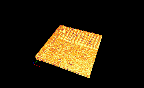 Maximum Intensity Projection
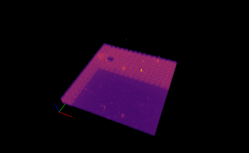 Point Cloud
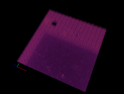
Fig. 5.21 3D projection modes#
- Color Scale
Selects the color scale. The intensity values in the 3D volume will be mapped onto this color scale.
- Color Minimum
The intensity value that corresponds to the minimum value of the selected color scale.
- Color Maximum
The intensity value that corresponds to the maximum value of the selected color scale.
- Opacity
Adjusts the global opacity of the mapping.
Hint
Projection methods can be mixed to achieve the desired output. Particles can be rendered as isosurfaces while the background intensity can be visualized by maximum intensity projection.
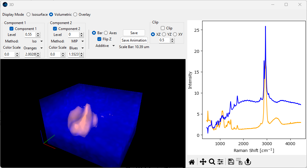
Fig. 5.22 Volumetric 3D display: Combining rendering modes (Isosurface + MIP).#
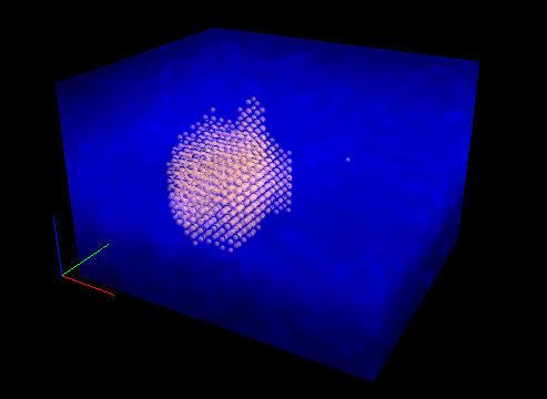
Fig. 5.23 Volumetric 3D display: Combining rendering modes (Point cloud + MIP).#
In addition some parameters affect the entire viewport:
- Scale
Allows switching between an XYZ scale bar (for an example see the Figure 5.22) or an axes cube (see Figure 5.20 for an example). The length of the XYZ scale in the rendered image is displayed in the top bar.
- Flip Z
Inverts the Z axis.
- Dark Background
Allows toggling between a white or black background. The color of the axes will be adjusted as required.
Warning
Please note that the Additive blend mode is incompatible with a white background.
- Blend Mode
Selects how the 3D projection of different objects in overlayed / blended - this will have no effect of only one object is displayed. See 3D blend modes for an example visualization.
Additive: Performs blending by color
Translucent: Performs blending by translucency (alpha value)
Translucent (no depth): Performs blending by translucency but performs no depth-testing.
Opaque: Performs no blending and renders the volume as solid color. While this precludes seeing the inside of the volume, the opaque projection mode can be used in conjunction with Clipping to visualize material distributions in three dimensions.
Tip
For maximum or minimum intensity projections, the Additive blend mode typically gives the most pleasing results as Translucency blending will result in the partial obstruction of the inner parts of the volume.
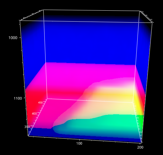
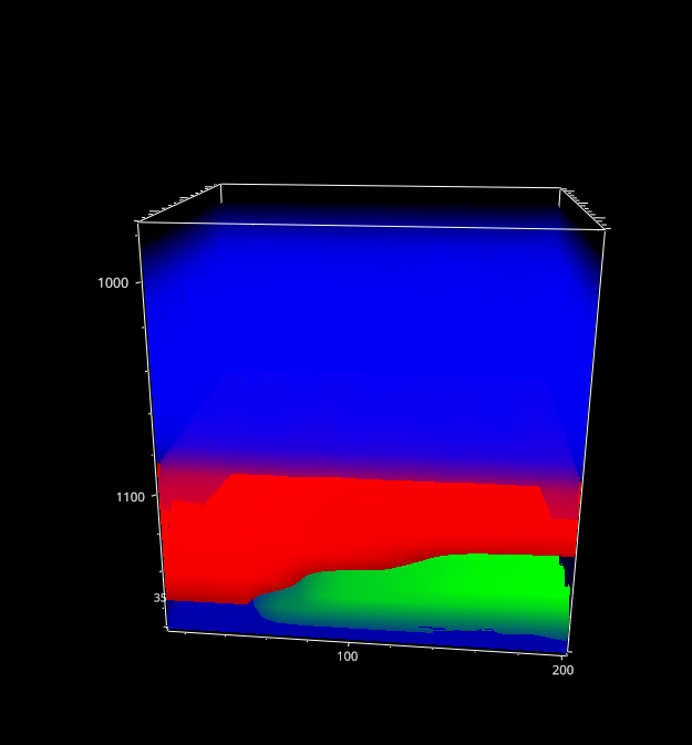
Fig. 5.24 3D blend modes#
- Save
Saves the currently displayed image as a bitmap (
.png,.jpg). Isosurfaces can additionally be exported as a Wavefront.objfile.- Save Animation
Saves the displayed data as an animation file to better visualize the depth of the data.
- Clip
Displays only a slice of the volume by clipping in a plane. The XY, YZ, and XZ radio buttons select which plane to use for clipping. The Fraction value selects which fraction of the volume to clip, for example 0.5 clips half the volume along the selected plane. Negative values will clip from the opposite end of the volume. This parameter can be animated to scan through a volume. The angles φ and θ adjust the angle of the clipping plane.
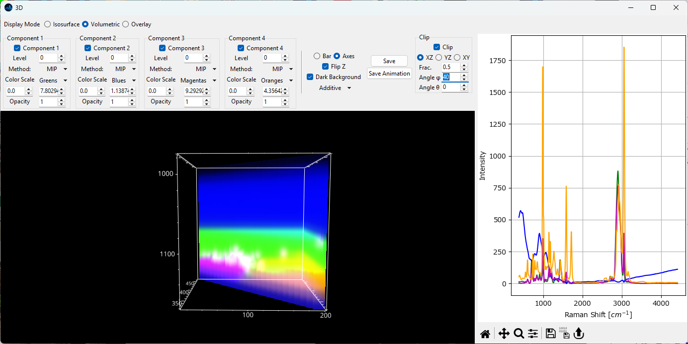
Fig. 5.25 The 3D volumetric rendering window - clipping.#
Hint
The easiest way to adjust the axes ranges in the Volumetric 3D Plot is to use Cropping to trim the dataset to the region of interest.
5.9.3. Animation Export#
Animating the 3D volumetric data can help to visualize the depth of the data. SMDExplorer allows animating the rotation about the X, Y, or Z axes. Animations can be saved as a single file (animated PNG, GIF, or animated WebP) or as a series of images that can be converted into a video using 3rd party software.
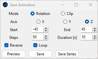
Fig. 5.26 Animation options.#
- Mode
The animation mode:
Rotation: Animates the rotation about an axis.
Clip: Animates clipping along an axis. See Clip for details.
- Axis
In Rotation mode, the axis about which to perform the rotation. In Clip mode, the axis along which to clip (e.g.
Zwill clip in the XY plane). The X-axis is displayed in red, the Y-axis in green, and the Z-axis in blue in the scale bar in the 3D window.- Start
In Rotation mode, the start angle (in degrees) of the animation relative to the current position. Set this value to 0 to animate from the current view. In Clip mode, the fraction of the volume to clip a the beginning of the animation. Set to 0 to use the full volume.
- End
In Rotation mode, the final angle (in degrees) of the animation relative to the current position. In Clip mode, the fraction of the volume to clip a the end of the animation. Negative values indicate clipping from the end of the volume.
- Steps
The number of frames to render.
- Duration
The duration of the animation in seconds.
- Reverse
When checked, the animation will proceed from \(\theta\) start to \(\theta\) end and then return to \(\theta\) start, doubling the duration / number of frames. This allows for seamless looping, resulting in an animation that oscillates between the two angles.
- Loop
Loops the image sequence.
- Preview
Displays a preview of the animation in the 3D window. Clicking the Preview button again stops this animation and returns to the original view port.
Note
The
ReverseandLoopparameters are ignored during the preview.- Save
Saves the animation as an animated PNG, GIF, or animated WebP file.
Warning
While GIF files enjoy widespread support, their limited color gamut makes them a poor choice for rendering high-quality animations. For best results, the lossless PNG is recommended. SMDExplorer prioritizes rendering quality over file size - a variety of online tools can be used to optimize the generated animation files if required.
- Save Series
Saves the animation as individual files, one file per frame. This allows the creation of animation or video files from the rendered frames using 3rd party software or online tools.
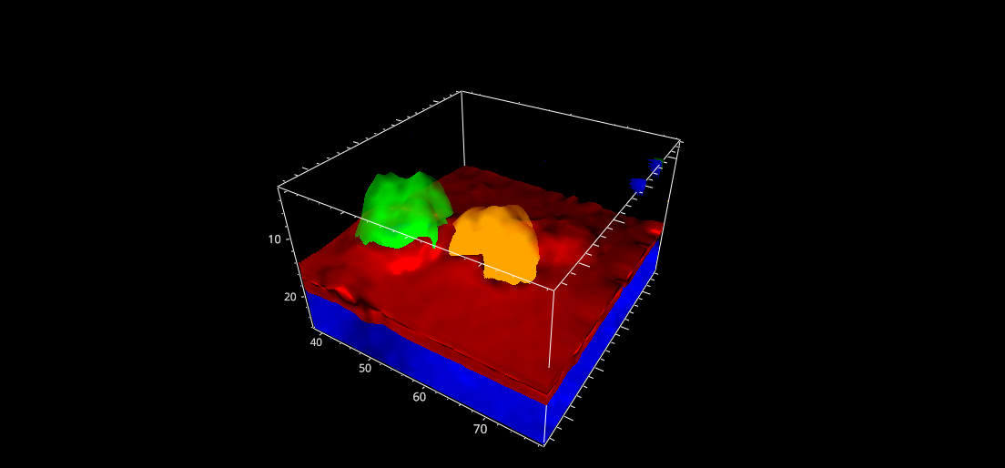
Fig. 5.27 A clipping animation.#
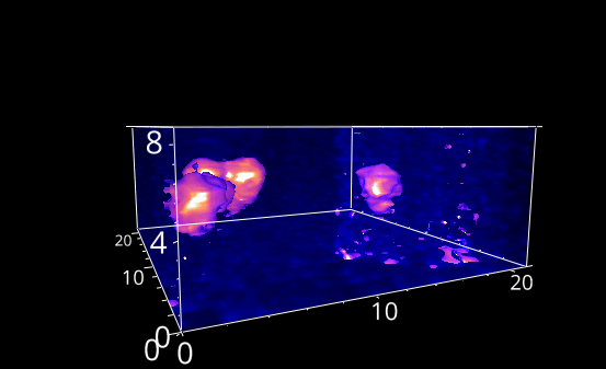
Fig. 5.28 A rotation animation.#
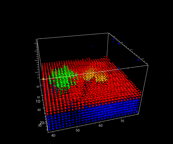
Fig. 5.29 A rotation animation.#
5.9.4. Slice Overlay#
In slice overlay mode, the 2D distribution of different components in a selected plane of a 3D volume can be visualized. This is the three-dimensional extension of the 2D overlay view and mirrors the controls found in the 3D mapping view.
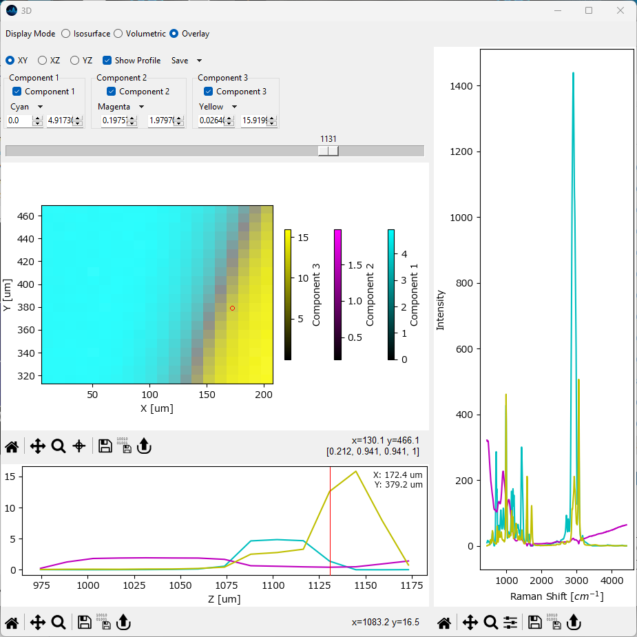
Fig. 5.30 The 3D overlay pane.#
Parameters
- Plane
Selects which planes of the volume to display (XY, XZ, or YZ). The Slider controls which plane to display.
- Color Scale
The color scale of the selected component
- Color Minimum
The intensity value that corresponds to the minimum value of the selected color scale.
- Color Maximum
The intensity value that corresponds to the maximum value of the selected color scale.
- Show Profile
Displays a profile along the selected point / region of the axis perpendicular to the selected plane.
- Save
Saves an animation / series of a scan of the selected planes with the currently selected visualization parameters.
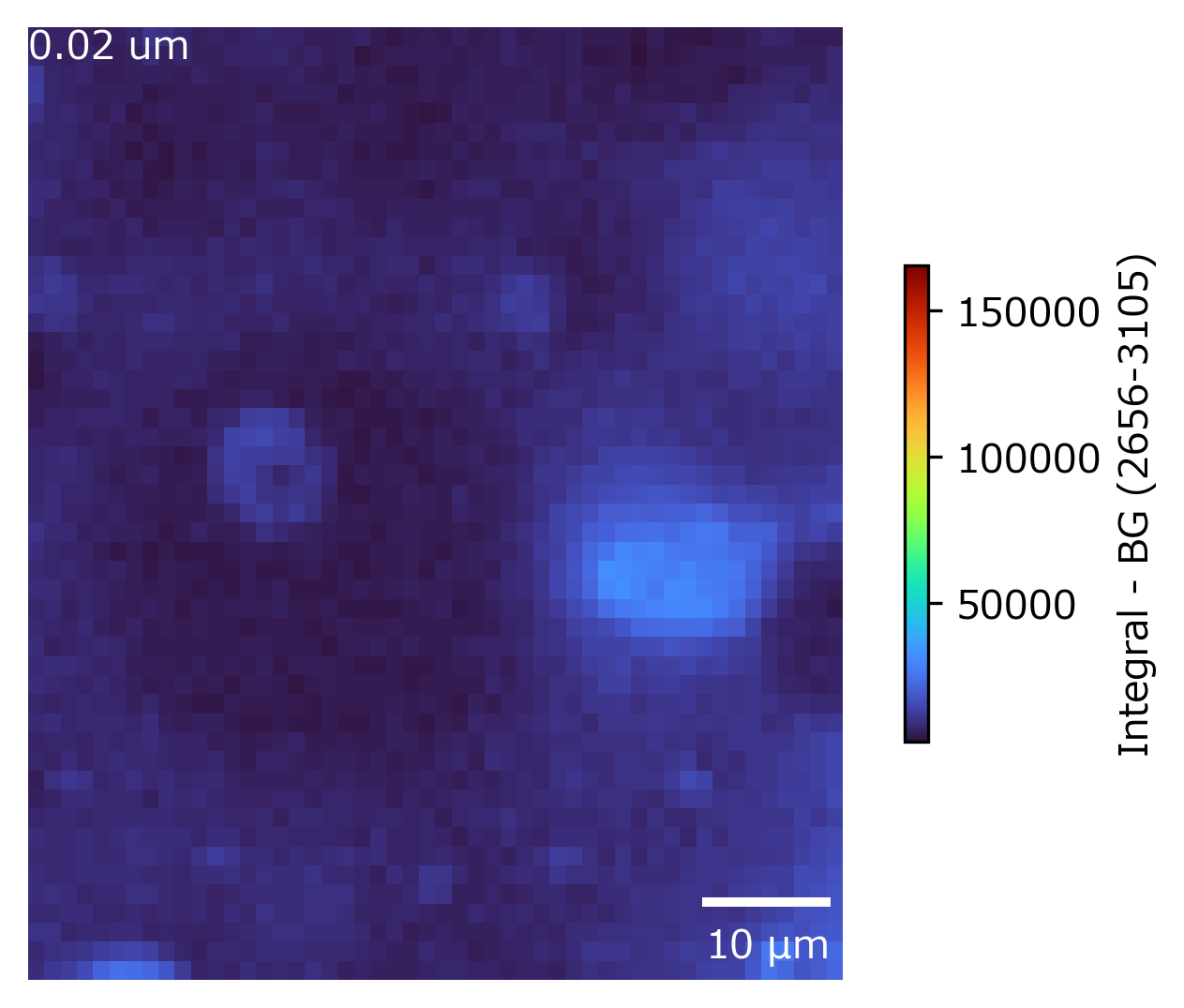
Fig. 5.31 A 2D projection volume animation.#